
The McDonald’s logo has come to represent so much more than just delicious fast food. Since it’s humble origins as a hamburger stand in California to a global powerhouse that serves over 100 countries, the McDonald’s logo has become a true cultural icon. You will struggle to find a single child in any of the serviced countries who doesn’t immediately recognise the fast food chain’s infamous “Golden Arches”.
More than just being easily recognisable, the McDonald’s logo inspires joy and excitement. Today, the very act of eating a McDonald’s has become a cultural phenomenon in its own right, bringing young and old together alike. In this blog, we’ll trace the development of the McDonald’s logo through time, and assess how effective branding has helped propel the popular eatery to the very top of the global fast food chain.
1940 – 1948: Origins of the McDonald’s Logo
It might surprise many to see that the original McDonald’s logo is a far cry from how it looks today. Set in a plain black font with three levels of text, the original logo prioritised advertising the brand as a dependable barbecue eatery, emphasising this above all else. Created at the time of the second world war, the logo did what it needed to; it conveyed the trust and authority of the brand to local audiences with its simple yet sophisticated nature. It also focused on selling the uniqueness of the brand with the value-loaded term ‘famous’, and linking this to the name of the restaurant founders: Richard and Maurice McDonald, to further build trust and loyalty.
1948 – 1953: Growing In Character
In the post-war era, the McDonald’s logo grew to develop even more character. Combining different elements, including a small smiley-faced character, big price signs, and a new emphasis on ‘hamburgers’, the McDonald’s brand attempted to distinguish itself by communicating itself as brand with greater character and personality. The tag-line ‘Buy em by the bag’ read was like it was spoken by someone, and overall the logo emphasised the affordability of the restaurant whilst still maintaining its focus on being a ‘famous’ and dependable brand, further building trust.
1953 – 1968: The McDonald’s Logo Enters The Modern Era
It wasn’t until the early 1950’s however when the brand fully stepped into the modern era with a simpler, more colorful logo with a sleeker-looking font. By this point, McDonald’s had fully established a name for itself in the rapidly growing fast food market of 1950’s America. This was so much the case, that the brand could now focus solely on pushing its founder’s names as a key marketing strategy. At a time when the American Middle Class was rapidly expanding, this playful and colourful logo could resonate with both kids and adults alike, slowly becoming a household name in American culture and gaining greater loyalty.
1961 – 1968: The ‘Golden Arches’ Take Shape
In the 1960’s, the McDonald’s logo as we know it today started ‘Golden Arches’ for the first time, albeit in a slightly different format. The yellow ‘M’, originally with a red outline, was also accompanied by an eye-catching slash through the middle. This design was inspired by the company’s first ever restaurants, which included both arches and a flat roof (symbolised by the slash).
For the first time, the McDonald’s logo adopted an appearance that could truly stand out from the crowd, conveying a stronger and more unique identity for the brand. The striking combination of red and yellow helped to communicate the joy and excitement that eating at a McDonald’s restaurant could bring, especially to children, marking a significant contrast to the colourless logos of the brand’s earlier days. The logo was still consistent however in keeping the McDonald’s name front and centre, further solidifying the brand’s name in fast food nomenclature.
1975 – 1993: The Golden Arches Take Center Stage
In the 1970’s, the brand further stepped into the modern era by stripping back and simplifying their iconic ‘Golden Arches’ logo. Removing the slash and the red outline, the brand decided to hone in further on their new red-and-yellow colour scheme, giving greater prominence to the arches in the process. The yellow ‘M’, with a sleeker shape and stronger contrast with the red background, was now more easily identifiable, coming to symbolise everything that you would expect from McDonald’s: tasty food and an exciting childhood dining experience.
With the brand’s name now taking up a more secondary position, the Golden Arches in and of themselves became strong enough to carry the brand’s message. The arches communicated the quality, reliability, and joy that the brand brought to customers, and started to be deployed en-mass across the restaurant’s packaging, further consolidating its central role in the restaurant’s marketing campaigns.
1993 – 2006: Further Modernisation
In the 90’s and noughties, the McDonald’s logo followed a popular design trend of the times by adopting a 3D effect for their iconic arches. However, the main takeaway from this era is that the Golden Arches had once and for all taken centre stage over the ‘McDonald’s’ brand name. Now, you didn’t need to read anything to know that there was tasty fast food nearby when you saw the iconic arches. The logo alone, elevated as high as possible on restaurant signage and even lit up at night, was enough to pull in hungry customers like moths to a flame.
2006 – Today: Minimalism Personified
Today, the McDonald’s logo follows another modern design trend in prioritisng minimalism to convey the brand’s message. Shaking off it’s more playful iterations, the McDonald’s logo has now stepped fully into the modern era, conveying greater sophistication and appealing to both young and old demographics alike. Perfectly suited for digitisation, the more minimalist golden arches are easily replicated across digital platforms, ideal for creating consistent marketing campaigns to effectively target both of these audiences. The McDonald’s logo therefore continues to convey the trust, reliability and joy that the brand brings, offering not just tasty fast food, but also a cultural experience in and of itself.
Consistency in Brand Identity
McDonald’s logo evolution strikes a careful balance between embracing change and preserving core brand elements. Although the design has shifted significantly over time, the Golden Arches have remained a focal point, strengthening brand recognition across generations. This approach ensures McDonald’s feels familiar to long-time customers whilst also attracting younger audiences, reinforcing the brand’s iconic status in the fast-food world.
Emotional Resonance
With the introduction of vibrant colors and playful characters, especially in the 1950’s and 60’s, McDonald’s began crafting an emotional connection with customers, especially families. The brand tapped into the joy and nostalgia of childhood dining experiences, creating a logo that conveyed happiness and a sense of belonging, which proved key in differentiating McDonald’s from its competitors over the years.
Adaptation to Global Markets
As McDonald’s expanded internationally, the logo adapted to communicate across cultures without losing its most recognisable traits. The minimalist Golden Arches design of recent decades works well in diverse settings and stands out on packaging and digital platforms alike, illustrating the brand’s adaptability as it enters new markets around the world.
Conclusion: The McDonald’s Logo Legacy
The Golden Arches have come to symbolise more than just fast food; they represent a brand legacy and a cultural experience. McDonald’s commitment to evolving while preserving the familiar elements of its logo signifies its strategy to remain a relevant and trusted brand. This enduring logo proves that brand design is a crucial element of effective marketing campaigns, and that adapting to new trends is crucial for remaining relevant to audiences young and old.
Reach Out To Chameleon Today
Here at Chameleon Web Services, we understand that a brand’s logo is far more than just a symbol—it’s the embodiment of its identity and story. Like McDonald’s, whose logo evolution reflects its journey from a local eatery to a global icon, we’re here to help businesses shape and refine their brand to stand the test of time.
Whether you’re launching a new business or looking to reinvent your existing business, our team of experienced web designers and Marketing specialists have the necessary skills to bring your brand vision to life. From concept to completion, we’ll work alongside you to build a logo and identity that not only resonates with audiences, but also stands head and shoulders above the competition. Are you ready to take the internet by storm? Reach out to Chameleon Web Services today!
To learn more about our own journey and see how we’ve evolved our brand over time, check out the Chameleon re-brand story.
Sections:
Share This Content
More Chameleon Insights

- Digital Marketing
- SEO
- Web Design
Google’s Core Update March 2025: 5 Key Tips for Businesses
Instead of worrying about where your site stands, Chameleon is here to help advise you on how your busyness's website can come out stronger, rather than weaker, following Google's Core Update March 2025 update.
28 Mar 2025
- Digital Marketing
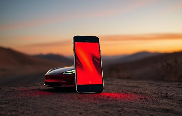
The Tesla Pi Phone Hoax: A Digital Marketing Case Study
The Tesla Pi Phone rumor which has been in circulation for years is a fascinating case study in how digital hype can take on a life of its own. But how did it happen? And what can digital marketers learn from it?
14 Mar 2025

- Digital Marketing
- Microsoft
End of an Era: Microsoft Shuts Down Skype
Skype quickly become a globally renowned platform for communications in 2003 when it was founded, disrupting the landline industry. For many families, it became a means of calling with audio and video, connecting people across the world with ease. At its peak, Skype boasted millions of users worldwide, with households and businesses adopting the platform…
07 Mar 2025

- Digital Marketing
- SEO
7 SEO Link-building Strategies that Work in 2025
We l breakdown our top 7 actionable SEO link-building strategies that you can use for your website.
14 Feb 2025

- Digital Marketing
Digital Marketing Trends to Look Out For in 2025
Digital marketing trends to look out for in 2025. Find out what marketing strategies are taking the world by storm this year and how your business can adapt.
31 Jan 2025

- Digital Marketing
Is Blogging Dead in 2025?
In the ever-evolving digital landscape, there is almost an expectation that one year, blogging will finally 'die', with video marketing, social media marketing and AI-generated content all waiting in the wings to take its place. But is blogging really dead in 2025? Well, this blog is here to prove it isn't.
31 Jan 2025

- Digital Marketing
- SEO
Why Local SEO Is More Important Than Ever in 2025
Boost your business in 2025 with expert local SEO strategies from Chameleon Web Services. Drive traffic, build trust, and stay ahead of the competition!
17 Jan 2025

- Digital Marketing
- SEO
SEO For Startups: 10 Essential Tips for Organic Growth
SEO for startups: boost your startup’s online presence with 10 essential SEO tips! Learn strategies for sustained organic growth today from leading SEO agency.
20 Dec 2024
- Branding
- Web Design
Jaguar’s New Logo: Calculated Gamble or Brand Implosion?
Jaguar's New Logo. Is Jaguar's controversial rebrand a bold move for the future or a betrayal of its luxury heritage? Chameleon dives deep into the topic.
06 Dec 2024

- Web Design
How to Use Colour in Web Design
Learn how to use color effectively in web design to convey mood, guide user actions, and enhance brand identity. Discover Chameleon’s bespoke design services.
22 Nov 2024

- Digital Marketing
How Important Is Competitor Research in SEO?
With effective competitor research, you can learn what is working well for your competitors, what tactics they use to achieve success, and what gaps there are in the market that you can exploit.
25 Oct 2024

- Web Design
8 Tips For Building Your New Company Website
Read our 8 top tips for creating a new company website. From web design to SEO, learn how your website can stand out in the digital landscape.
11 Oct 2024