In the highly competitive telecommunications industry, branding is crucial for establishing a company’s identity. It builds customer loyalty and differentiates the brand from competitors. British Telecommunications plc, commonly known as BT, has a storied history reflected in the evolution of the BT logo.
Since its establishment in 1969, BT has grown to provide a variety of services, such as broadband, mobile telephony and digital television, to almost 20 million customers throughout all of its subsidiaries.
Each transformation of the BT logo represents a strategic marketing decision. Aimed at conveying BT’s brand values, adapting to market trends, and resonating with its current target audience. Let’s explore the evolution of the BT logo from a marketing perspective and understand the rationale behind each redesign.
1969 – 1975: Establishing Authority
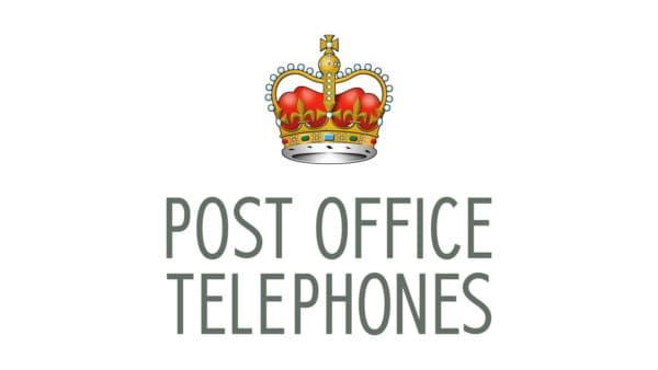
BT’s journey began with the General Post Office (GPO), which managed the UK’s telecommunication services. In 1969, when the GPO’s telecommunications division was rebranded as Post Office Telecommunications, the logo featured a crown emblem and a bold typeface. From a marketing perspective, this design conveyed authority, trustworthiness, and stability—key attributes for a government entity that was managing the national communications infrastructure.
1975 – 1981: Transition and Recognition
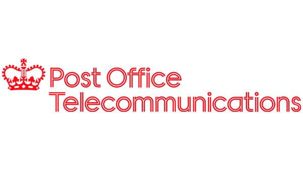
The mid-1970s saw the transition of Post Office Telecommunications to a more recognisable entity. During this period, the logo retained the traditional elements but introduced slight modifications to modernise the brand’s appearance. This change aimed to maintain public trust while signalling an evolving organisation.
1981 – 1991: Modernisation and Privatisation
The 1980s brought privatisation, and British Telecom emerged as a distinct entity. The 1981 logo introduced sleek, modern typography with the letters “BT” encircled, symbolising connectivity and global reach. This logo was designed to reposition BT as a dynamic, forward-thinking company, appealing to a market increasingly aware of technological advancements and global communication possibilities.
1991 – 1999: The Piper Era
In the early 1990s, BT’s branding took a bold turn with the introduction of the “Piper” logo. Created by Wolff Olins, this logo featured a stylised human figure playing a flute, symbolising communication and creativity. The Piper logo was a significant departure from conventional telecom branding, aiming to humanise the brand and connect emotionally with customers. It was a strategic move to highlight BT’s innovative spirit and differentiate it from competitors.
1999 – 2003: A Transitional Phase

The late 1990s and early 2000s marked a transitional phase for BT. The logo was refined to blend the elements of the Piper logo with more modern aesthetics. This iteration aimed to bridge the gap between BT’s established identity and its aspirations to be seen as a leader in the rapidly evolving telecom landscape.
2003 – 2019: Embracing the Digital Age
As the new millennium approached, BT needed to align its brand with the digital revolution. The 2003 logo featured a colourful globe with abstract shapes, representing BT’s global presence and digital capabilities. This design was vibrant and dynamic, aimed at positioning BT as a leader in the digital age and appealing to a tech-savvy audience. It communicated BT’s evolution from traditional telecommunications to encompassing cutting-edge digital services.
2019 – Today: A Timeless Identity
The current logo, introduced in 2019, embraces minimalism with the letters “BT” enclosed within a simple circle. This design reflects clarity, confidence, and reliability. From a marketing perspective, the minimalist approach ensures a timeless appeal and strong visual identity. It underscores BT’s evolution into a modern telecommunications and digital services provider while maintaining a nod to its rich heritage.
Marketing Insights and Strategic Implications
Consistency and Evolution
BT’s logo evolution demonstrates a balance between consistency and adaptability. While the designs have changed significantly over time, each logo retains core elements that reinforce brand recognition. This approach ensures that BT remains familiar to long-time customers while appealing to new audiences.
Emotional Connection
The introduction of the Piper logo in the 1990s marked a shift towards creating an emotional connection with customers. By humanising the brand, BT positioned itself as more than just a telecom provider—it became a symbol of innovation and creativity. This strategy was crucial in differentiating BT in a competitive market.
Digital Transformation
The logos from the 2000s onwards reflect BT’s strategic pivot towards digital services. By incorporating dynamic and modern design elements, BT effectively communicated its transformation and relevance in the digital age. This move was essential for attracting tech-savvy consumers and positioning BT as a leader in the industry.
BT Logo Evolution Expertise
The evolution of the BT logo is a testament to the company’s strategic marketing acumen. Each redesign has been carefully crafted to reflect changing market dynamics, technological advancements, and shifting consumer preferences. As BT continues to evolve, its logo will remain a powerful symbol of its enduring legacy and future aspirations, consistently aligning with its brand values and market positioning.
Reach Out to Us at Chameleon
At Chameleon, we know a brand’s identity is its most valuable asset. Just as BT has evolved over the decades, we help businesses transform their brand identities to reflect their vision and market dynamics. And even used our skills to do it for ourselves with the development of our new website!
Whether you’re a startup making your mark or an established company refreshing your image, our creative experts are here to guide you. Reach out to us at Chameleon and let us help you create a lasting impression.
To learn more about our journey and see how we’ve evolved our brand, check out the Chameleon re-brand story.
Sections:
Share This Content
More Chameleon Insights
- Digital Marketing
- SEO
- Web Design
Google’s Core Update March 2025: 5 Key Tips for Businesses
Instead of worrying about where your site stands, Chameleon is here to help advise you on how your busyness's website can come out stronger, rather than weaker, following Google's Core Update March 2025 update.
28 Mar 2025
- Digital Marketing
The Tesla Pi Phone Hoax: A Digital Marketing Case Study
The Tesla Pi Phone rumor which has been in circulation for years is a fascinating case study in how digital hype can take on a life of its own. But how did it happen? And what can digital marketers learn from it?
14 Mar 2025
- Digital Marketing
- Microsoft
End of an Era: Microsoft Shuts Down Skype
Skype quickly become a globally renowned platform for communications in 2003 when it was founded, disrupting the landline industry. For many families, it became a means of calling with audio and video, connecting people across the world with ease. At its peak, Skype boasted millions of users worldwide, with households and businesses adopting the platform…
07 Mar 2025
- Digital Marketing
- SEO
7 SEO Link-building Strategies that Work in 2025
We l breakdown our top 7 actionable SEO link-building strategies that you can use for your website.
14 Feb 2025
- Digital Marketing
Digital Marketing Trends to Look Out For in 2025
Digital marketing trends to look out for in 2025. Find out what marketing strategies are taking the world by storm this year and how your business can adapt.
31 Jan 2025
- Digital Marketing
Is Blogging Dead in 2025?
In the ever-evolving digital landscape, there is almost an expectation that one year, blogging will finally 'die', with video marketing, social media marketing and AI-generated content all waiting in the wings to take its place. But is blogging really dead in 2025? Well, this blog is here to prove it isn't.
31 Jan 2025
- Digital Marketing
- SEO
Why Local SEO Is More Important Than Ever in 2025
Boost your business in 2025 with expert local SEO strategies from Chameleon Web Services. Drive traffic, build trust, and stay ahead of the competition!
17 Jan 2025
- Digital Marketing
- SEO
SEO For Startups: 10 Essential Tips for Organic Growth
SEO for startups: boost your startup’s online presence with 10 essential SEO tips! Learn strategies for sustained organic growth today from leading SEO agency.
20 Dec 2024
- Branding
- Web Design
Jaguar’s New Logo: Calculated Gamble or Brand Implosion?
Jaguar's New Logo. Is Jaguar's controversial rebrand a bold move for the future or a betrayal of its luxury heritage? Chameleon dives deep into the topic.
06 Dec 2024
- Web Design
How to Use Colour in Web Design
Learn how to use color effectively in web design to convey mood, guide user actions, and enhance brand identity. Discover Chameleon’s bespoke design services.
22 Nov 2024
- Web Design
The Evolution of the McDonald’s Logo
The evolution of the McDonald's logo reveals over 80 years of brand growth. Learn how branding helped shape a fast-food cultural phenomenon.
08 Nov 2024
- Digital Marketing
How Important Is Competitor Research in SEO?
With effective competitor research, you can learn what is working well for your competitors, what tactics they use to achieve success, and what gaps there are in the market that you can exploit.
25 Oct 2024


