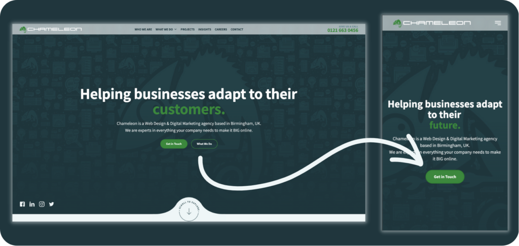
Making sure your website is mobile optimised is more important than ever. As most website users in 2023 are using their mobile phones to search.
At Chameleon, we ensure every single website we create is mobile optimised. We would never make a site live without checking it works on every device, with desktop, tablet and phone.
The web developers have a number of things they do when mobile optimising their websites, here’s a few items from their checklist.
Check The Website Speed Is Mobile Optimised
This is the number one frustrating factor on websites. With the advancement of technology, users expect to get what they’re looking for immediately.
If your website is taking more than a few seconds to load, they’ll find the information they need somewhere else.
This can lead to high bounce rates on your website, which isn’t good for the SEO of your website or the position of your website on Google.

Resizing The Images For Mobile
Images and videos on your website shouldn’t be too large for mobile, as they can take a long time to load.
Make sure to compress your images and use smaller file sizes to optimise your website for mobile, as this will reduce the loading time of the website.
This is standard practice for the web designers at Chameleon, as they’ve seen this issue with previous websites and now implement this on all new websites before it becomes a problem for our clients.

Create A Responsive Website Layout
A responsive website design will mould to the device that it’s loaded on. So your website will look aesthetically pleasing on every screen size, from desktop through to mobile.
An example would be where your website jumps from a two column design on a large screen, to a single column design on a mobile phone.
This can also mean that a website with a responsive design has the same loading time across all screen sizes, so your website speed stays up to a high standard.

Don’t Put Links Too Close
Ensure all links on a website page are spaced out on mobile design. It’s much easier to click on the exact link when using a computer mouse.
We’ve all had it happen to us. You’re trying to click on something on your phone, or a tablet, and it just KEEPS opening the wrong link!
This can be extremely irritating to users on your website, and they may just click off your website altogether. So make sure to leave enough space between links for clumsy thumbs to have easy access!

Add Mobile Optimised Navigation
The use of white space and decluttering your design is essential to a clean-looking and effective mobile optimised website.
Make it easy for your user to view everything at a glance. Keep things organised to make sure they only get shown the necessary information at each point.
Update the menu to include drop downs, instead of super long lists of options. Also, using the hamburger menu to replace the header, as this saves space on your website pages and lets your user access the menu when they choose to.

Test Your Website On Mobile
And the final KEY point is to actively check your website on different mobile devices, ie. both Android and iOS.
Test that the user experience is just as good as your desktop website design. And don’t forget to check tablet screen size!

Contact Chameleon For A Mobile Optimised Website
The Chameleon team of web developers are experts in creating a fully mobile optimised website for our clients.
If your website isn’t up to scratch, then get in contact with us for a FREE audit of your site and find out how we can help your business.
Sections:
Share This Content
More Chameleon Insights
- Digital Marketing
- SEO
- Web Design
Google’s Core Update March 2025: 5 Key Tips for Businesses
Instead of worrying about where your site stands, Chameleon is here to help advise you on how your busyness's website can come out stronger, rather than weaker, following Google's Core Update March 2025 update.
28 Mar 2025
- Digital Marketing
The Tesla Pi Phone Hoax: A Digital Marketing Case Study
The Tesla Pi Phone rumor which has been in circulation for years is a fascinating case study in how digital hype can take on a life of its own. But how did it happen? And what can digital marketers learn from it?
14 Mar 2025
- Digital Marketing
- SEO
7 SEO Link-building Strategies that Work in 2025
We l breakdown our top 7 actionable SEO link-building strategies that you can use for your website.
14 Feb 2025
- Digital Marketing
Digital Marketing Trends to Look Out For in 2025
Digital marketing trends to look out for in 2025. Find out what marketing strategies are taking the world by storm this year and how your business can adapt.
31 Jan 2025
- Digital Marketing
Is Blogging Dead in 2025?
In the ever-evolving digital landscape, there is almost an expectation that one year, blogging will finally 'die', with video marketing, social media marketing and AI-generated content all waiting in the wings to take its place. But is blogging really dead in 2025? Well, this blog is here to prove it isn't.
31 Jan 2025
- Digital Marketing
- SEO
Why Local SEO Is More Important Than Ever in 2025
Boost your business in 2025 with expert local SEO strategies from Chameleon Web Services. Drive traffic, build trust, and stay ahead of the competition!
17 Jan 2025
- Digital Marketing
- SEO
SEO For Startups: 10 Essential Tips for Organic Growth
SEO for startups: boost your startup’s online presence with 10 essential SEO tips! Learn strategies for sustained organic growth today from leading SEO agency.
20 Dec 2024
- Branding
- Web Design
Jaguar’s New Logo: Calculated Gamble or Brand Implosion?
Jaguar's New Logo. Is Jaguar's controversial rebrand a bold move for the future or a betrayal of its luxury heritage? Chameleon dives deep into the topic.
06 Dec 2024
- Web Design
How to Use Colour in Web Design
Learn how to use color effectively in web design to convey mood, guide user actions, and enhance brand identity. Discover Chameleon’s bespoke design services.
22 Nov 2024
- Web Design
The Evolution of the McDonald’s Logo
The evolution of the McDonald's logo reveals over 80 years of brand growth. Learn how branding helped shape a fast-food cultural phenomenon.
08 Nov 2024
- Digital Marketing
How Important Is Competitor Research in SEO?
With effective competitor research, you can learn what is working well for your competitors, what tactics they use to achieve success, and what gaps there are in the market that you can exploit.
25 Oct 2024
- Web Design
8 Tips For Building Your New Company Website
Read our 8 top tips for creating a new company website. From web design to SEO, learn how your website can stand out in the digital landscape.
11 Oct 2024


