A near-perfect website might be difficult to create if you are not a skilled website designer. Utilising templates and eye-catching themes will help, but you’ll also need to understand certain fundamental principles if you want to get the greatest outcomes. In addition, there is so much rivalry that occasionally it seems like everyone else’s websites are more attractive than yours! Additionally, there are so many options available online that you only have a limited amount of time to determine which strategies would benefit or hurt your website.
We’ll go over the basic dos and don’ts of successful website design in this post, which may help you create web pages that are eye-catching, actionable, converting, and optimised. We’ll go through eight web design components and learn the dos and don’ts for each. So let’s get started!
Website Layout
The layouts of your website must be decided upon before you start building it. By grouping necessary components, the layouts serve as patterns or frameworks that determine the structure of your website and offer distinct navigation pathways inside web pages.
We’ll go through the dos and don’ts of website layout in this web design style guide, as well as some tips on how to make a neat and recognisable design:
Dos of Website Layout
- Be sure to adhere to the UX (User Experience) guidelines that people are familiar with.
- Put the user’s needs first.
- Use standardised design elements.
The goal of your web design should always be to improve the user experience, and the first step in doing this is to make sure the UX is consistent, user-friendly, and well-known. Common design features should be included on your website so that visitors don’t have to stop and consider the significance of the items you’ve employed.
Don’ts of Website Layout
- Avoid employing a completely novel or intricate arrangement.
- Don’t over-complicate things.
- Reduce clutter.
Check out the Google Meet website page to see how, while being one of the most well-known and forward-thinking companies, Google has prioritised usability and simplicity:
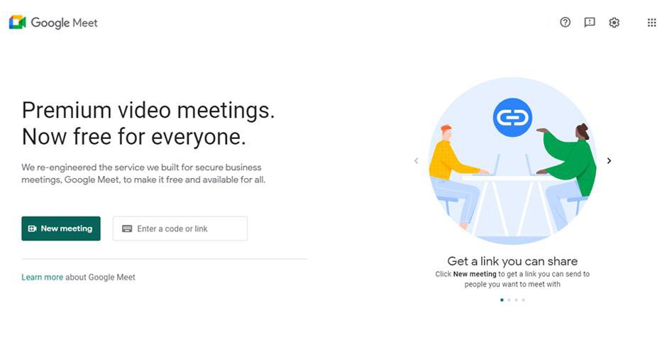
Even if we value creativity, it’s crucial to realise that any new idea shouldn’t interfere with the user’s experience. That’s why the majority of web design professionals shy away from utilising an entirely new or different style that their audience isn’t familiar with.
Typography
There is a widespread assumption that proper use of typefaces are only for experienced or tech-savvy web designers. But that is untrue. It’s important to take typefaces into account when designing a company website in addition to photographs and colours.
You will discover the dos and don’ts of typography—which has a big impact on how people perceive a brand—through this web design style guide. Fonts shouldn’t just be an afterthought, but rather at the centre of the design process, is the important thing to keep in mind.
Dos of Typography
- Pick typefaces that go with the look of your brand.
- Make the headlines big.
- Ample space should be left between text elements.
Don’ts of Typography
- Do not use all capital letters for continuous text.
- Avoid using common and unattrative typefaces.
- Use no more than three different typefaces.
We have used these rules on our client, Chain Free Property Buyers, and the results is a crisp, easy to use design.
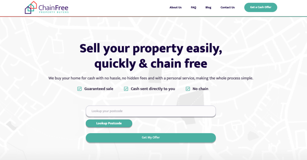
You should understand how fonts function as a website designer in order to select the ideal font for your design. Different typefaces evoke different emotions and have different aesthetic appeal, therefore they have the capacity to create a certain reaction in a user.
Website Content
Keep in mind that one of your website’s biggest advantages is it’s copy. And in order to maximise the effectiveness of your website, you should approach it strategically.
Therefore, concentrate on improving your copy so that it conveys a strong, concise message that also appeals to your target audience.
Dos of Website Content Writing
- Get to to the point; offer engaging, attention-grabbing, and instructive material.
- Always proofread and check for grammatical issues on your website.
- Where necessary, use bullets and numbers.
- Adopt a deliberate, targeted, and efficient content strategy.
- Be succinct, but not overly so.
Don’ts of Website Content Writing
- Avoid being unoriginal or dull.
- Avoid using excessive text.
- Avoid plagiarism.
- Limit your use of keywords.
In the example below, our client, Hush Bedrooms, needed simple and effective copy to upsell their products. The final choice of text works brilliantly to maximise ease-of-use and upselling the additional products.
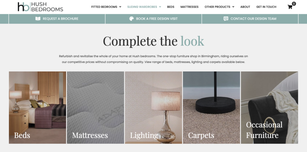
When writing, make an effort to employ the appropriate tone of voice. Be succinct, use appropriate terminology, and write in a way that encourages site users to browse and spend more time there.
White Space
It is exactly what it sounds like – white space. Even if the name conveys a sense of simplicity, if you don’t understand the rules for utilising it correctly, it can still cause confusion. The text-free areas of a website should be balanced since too much text can make a page look empty and too little can make your page appear crowded.
Dos of White Space
- Make sure that each piece can be distinguished from the others.
- Use wider spaces to denote a change in the kind of content.
- Make sure that all essential elements can be easily distinguished from non-essential ones.
- Give CTSs a lot of white space.
Apple is one of our favourite web design inspirations. They have absolutely nailed the use of white space in their designs.

As you can see, when we say white space, we don’t necessarily mean WHITE space. White space simply refers the space that has no elements in it. On Apple’s MacBook Pro page for example, the negative space is black.
Don’ts of White Space
- Maintain consistency by placing the same amount of space between each line of text.
- Avoid ignoring empty space.
You need to leave enough of white space around the content on your webpage for it to actually stand out. It’s a balancing act that is more difficult than it seems to get right!
Navigation
The navigation of your website is crucial to converting highly. In other words, it’s your website’s primary interaction and is absolutely vital. Your website’s navigation must be simple and clear in order for visitors to always be able to discover what they’re searching for.
Dos of Website Navigation
- Navigate using labels that are clear.
- Use well-known terms wherever possible.
- Use contrasting colours for text and navigation buttons at all times to ensure that your readers are never more than three clicks away from what they are looking for.
- Where feasible, concentrate on the content and reduce navigation.
- Adapt navigation to the content and the size of the screen.

CTS Direct have a lovely bright blue as part of their branding which made contrasting buttons easy to do.
Don’ts of Website Navigation
- Don’t waste your users’ time. Instead, use your navigation to make it easier for them to discover what they need.
- Avoid using elaborate navigational techniques.
- Don’t change the style of navigation from page to page.
- Don’t conceal important navigation.
Web designers can strive to be a little too inventive with their designs, navigation, and page layouts. But innovation may sometimes be detrimental to user-friendliness. Therefore, consumers will find it challenging to obtain the information they’re seeking for and may finally move elsewhere if you deviate too much from the accepted rules.
Optimising Images
For your website, high-quality photographs are crucial. These pictures not only provide an immersive experience but also assist in interactively telling your brand tales. In addition to improving user experience and adhering to Google’s recommended practises, optimising your website’s photos will raise its rating in search results.
Dos for Website Images
- Use clipart or photos to which you have rights or a licence.
- Put descriptions in the Alt text of each photograph you publish to your website.
- Resize image to optimise speed.
- Ensure that the size and style of each image are the same.
- Combining appropriate text and visuals.
Don’ts of Website Images
- Never post someone else’s photos without getting their permission.
- Don’t overuse keywords in the names of your picture files.
- Never use subpar photos on a website.
The practice should always be to optimise your images in order to prevent excessive cloud storage usage and to protect from a bad user-experience. Apps, plugins, and software are all available for image optimisation.
Contrasting Backgrounds
Website backgrounds have a significant influence on visitors and improve the website’s aesthetic appeal. They enable web designers to unleash their creativity and enhance the usability of websites in various ways. But you have to get them right!
Dos of Website Background Design
- combine with text to add more visual interest.
- Use distinguishing features, such as illustrations or a splash of colour.
- Use a bright background if your text is dark.
- Use a dark background if your text is light.
- Utilize UI (User Interface) colour tricks.
- If you don’t have the right photos, try putting a gradient of block colour overlay over the image.
Don’ts of Website Background Design
- Avoid using low-quality background photos.
- Avoid photos that are crowded or cluttered.
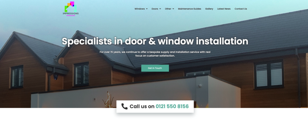
On Impressions Windows, for example, the lighter text sits nicely over the dark roof of the house, and the darker text sits nicely over the lighter colour of the sky.
When utilising a picture as the backdrop of your website, be sure to pick one that will scale well, even on tiny screens. For instance, a broad image could not display properly on a phone. Therefore, when selecting such a photo, you must also consider its mobile-friendliness.
Speed Optimisation
For SEO and simple loading, website speed optimization is essential for all websites. Therefore, it is essential to employ these aspects while building websites in order to make them load more quickly.
Dos of Website Speed Optimisation
- Gzip compression can be used to minimise file size.
- Store static files like media files, HTML texts, and JavaScript using browser caching.
- Minify JavaScript and CSS.
Don’ts of Website Speed Optimisation
- Avoid using external scripts and pop-ups that clutter the website.
- Avoid developing complex or flawed code.
- Refrain from using big flashy content.
- Removed unused plugins.
We are aware that improving website performance frequently involves making mistakes. It requires a lot of effort and constant practise. But as time goes on, you’ll get fantastic outcomes that will improve client satisfaction and SEO ranking.
Conclusion: Keep It ‘Simple’
You’ve done a good job when your website is simple and yet still has a compelling, interesting design. The majority of us create complicated websites as a result of putting too much emphasis on making the web design distinctive. The more clutter there is, the less appealing it is.
While we constantly advise you to try new things and observe what works best for your users, we’d like to remind you that there are no hard and fast rules when it comes to creating things.
In actuality, breaking traditional conventions is a hallmark of the finest website designs. Use this guide as a starting point for your web design, but do not hesitate to trust your creative instincts.
An effective website requires the designer to think like an artist, an end user, and a businessman; the ultimate result will be a website that converts well, is easy to use, and looks excellent.
If after all this, you have decided that you’d like us to utilise our wealth of knowledge to design your website for you, get in touch with us to speak to our brilliant web designers in Birmingham, and see what we can create for you!
Sections:
Share This Content
More Chameleon Insights
- Digital Marketing
- SEO
- Web Design
Google’s Core Update March 2025: 5 Key Tips for Businesses
Instead of worrying about where your site stands, Chameleon is here to help advise you on how your busyness's website can come out stronger, rather than weaker, following Google's Core Update March 2025 update.
28 Mar 2025
- Digital Marketing
The Tesla Pi Phone Hoax: A Digital Marketing Case Study
The Tesla Pi Phone rumor which has been in circulation for years is a fascinating case study in how digital hype can take on a life of its own. But how did it happen? And what can digital marketers learn from it?
14 Mar 2025
- Digital Marketing
- SEO
7 SEO Link-building Strategies that Work in 2025
We l breakdown our top 7 actionable SEO link-building strategies that you can use for your website.
14 Feb 2025
- Digital Marketing
Digital Marketing Trends to Look Out For in 2025
Digital marketing trends to look out for in 2025. Find out what marketing strategies are taking the world by storm this year and how your business can adapt.
31 Jan 2025
- Digital Marketing
Is Blogging Dead in 2025?
In the ever-evolving digital landscape, there is almost an expectation that one year, blogging will finally 'die', with video marketing, social media marketing and AI-generated content all waiting in the wings to take its place. But is blogging really dead in 2025? Well, this blog is here to prove it isn't.
31 Jan 2025
- Digital Marketing
- SEO
Why Local SEO Is More Important Than Ever in 2025
Boost your business in 2025 with expert local SEO strategies from Chameleon Web Services. Drive traffic, build trust, and stay ahead of the competition!
17 Jan 2025
- Digital Marketing
- SEO
SEO For Startups: 10 Essential Tips for Organic Growth
SEO for startups: boost your startup’s online presence with 10 essential SEO tips! Learn strategies for sustained organic growth today from leading SEO agency.
20 Dec 2024
- Branding
- Web Design
Jaguar’s New Logo: Calculated Gamble or Brand Implosion?
Jaguar's New Logo. Is Jaguar's controversial rebrand a bold move for the future or a betrayal of its luxury heritage? Chameleon dives deep into the topic.
06 Dec 2024
- Web Design
How to Use Colour in Web Design
Learn how to use color effectively in web design to convey mood, guide user actions, and enhance brand identity. Discover Chameleon’s bespoke design services.
22 Nov 2024
- Web Design
The Evolution of the McDonald’s Logo
The evolution of the McDonald's logo reveals over 80 years of brand growth. Learn how branding helped shape a fast-food cultural phenomenon.
08 Nov 2024
- Digital Marketing
How Important Is Competitor Research in SEO?
With effective competitor research, you can learn what is working well for your competitors, what tactics they use to achieve success, and what gaps there are in the market that you can exploit.
25 Oct 2024
- Web Design
8 Tips For Building Your New Company Website
Read our 8 top tips for creating a new company website. From web design to SEO, learn how your website can stand out in the digital landscape.
11 Oct 2024


